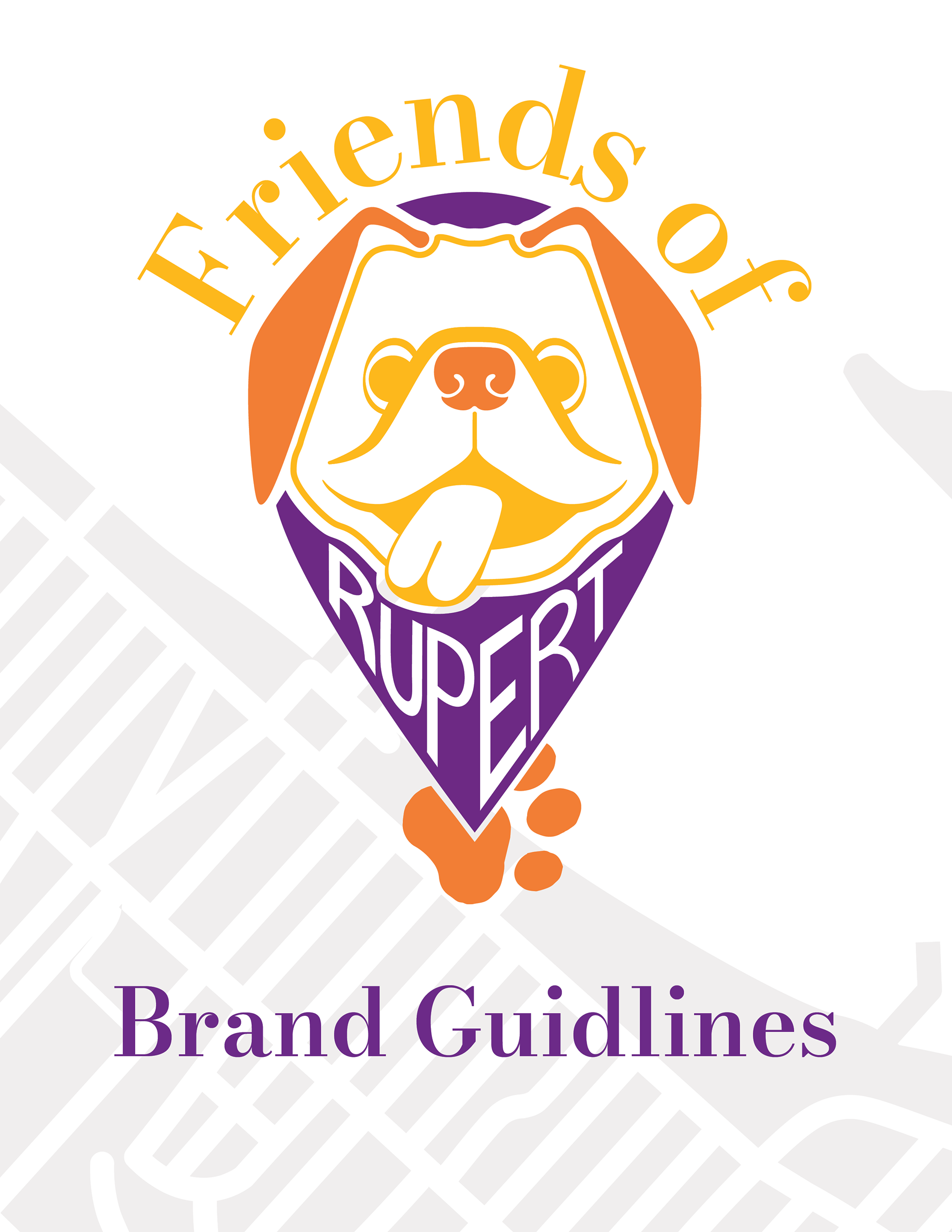
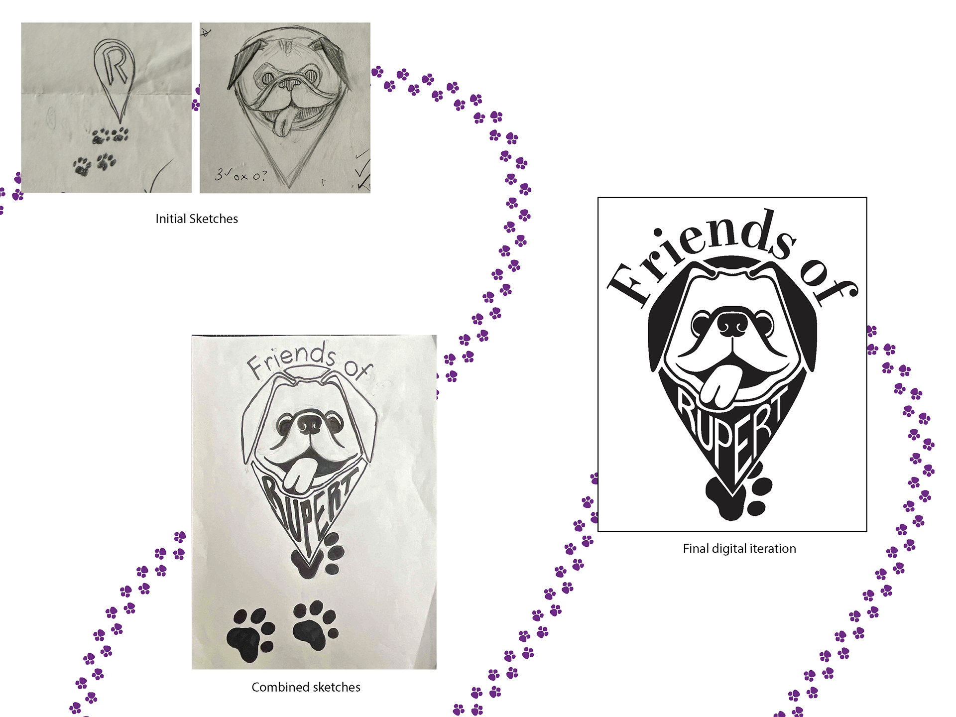
Logo Development: starting with an overview and 15 small sketches. Some were developed further, and some were combined. After these secondhand drawings, they brought them into Illustrator and developed them from there. Above are the three stages of the logo I ultimately selected. The sketches were originally a dog-faced icon and an icon with the letter R with footprints leading up to it. My drawing, which was the combined sketches, had preserved the dog prints and separated the face in the eye icon, empty space, making it appear like a bandanna. In the end, the look isn't that much different, but it is more refined, and the typeface used for the first part is varied in weights to emulate the various line thicknesses in the logo itself.
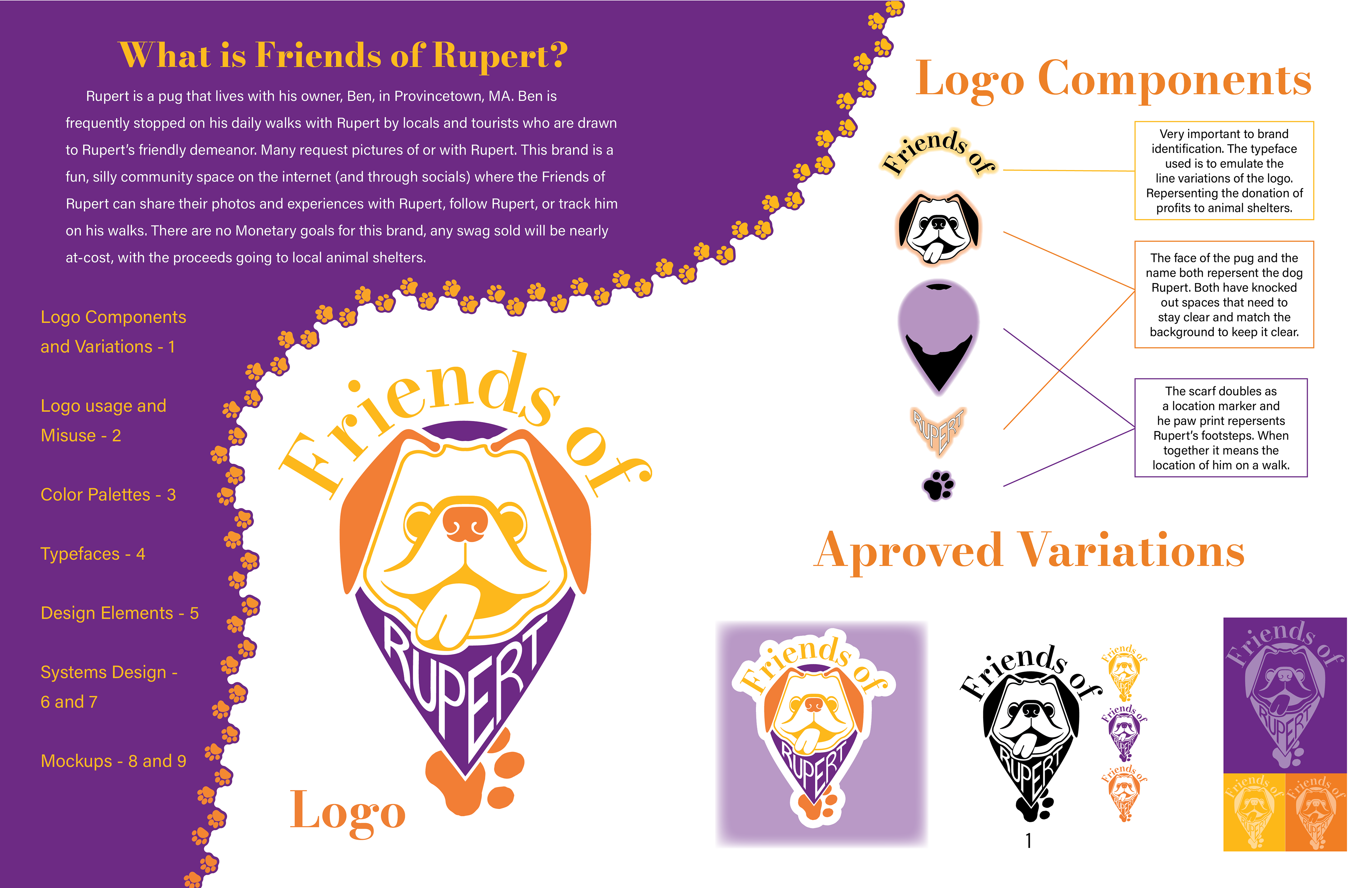
Introduction page with a logo components breakdown, explaining the different aspects and meanings of the elements.
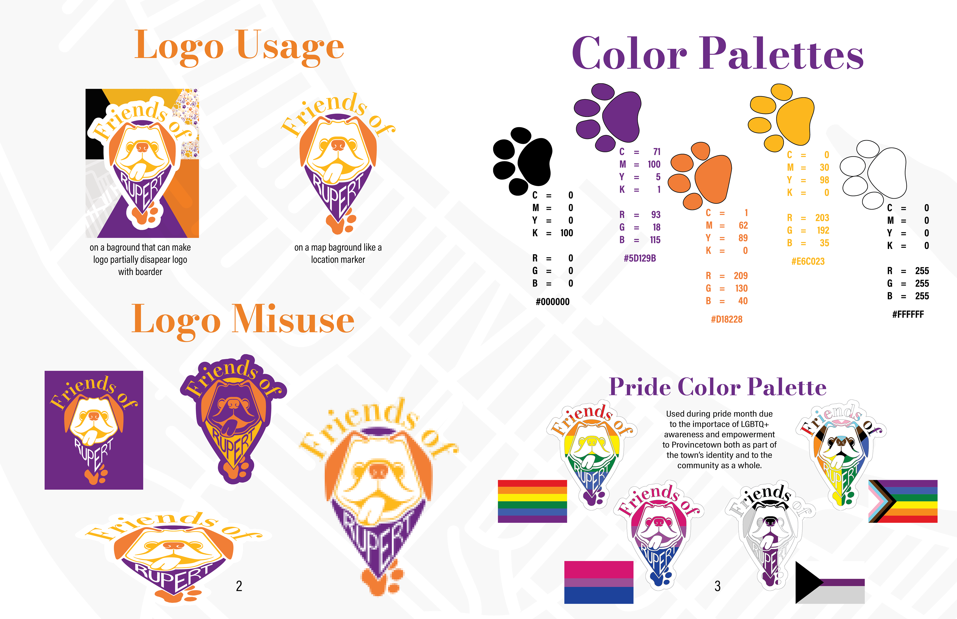
Logo misuse and usage, as well as color palette, and a pride, color palette due to the connection of Provincetown and pride.
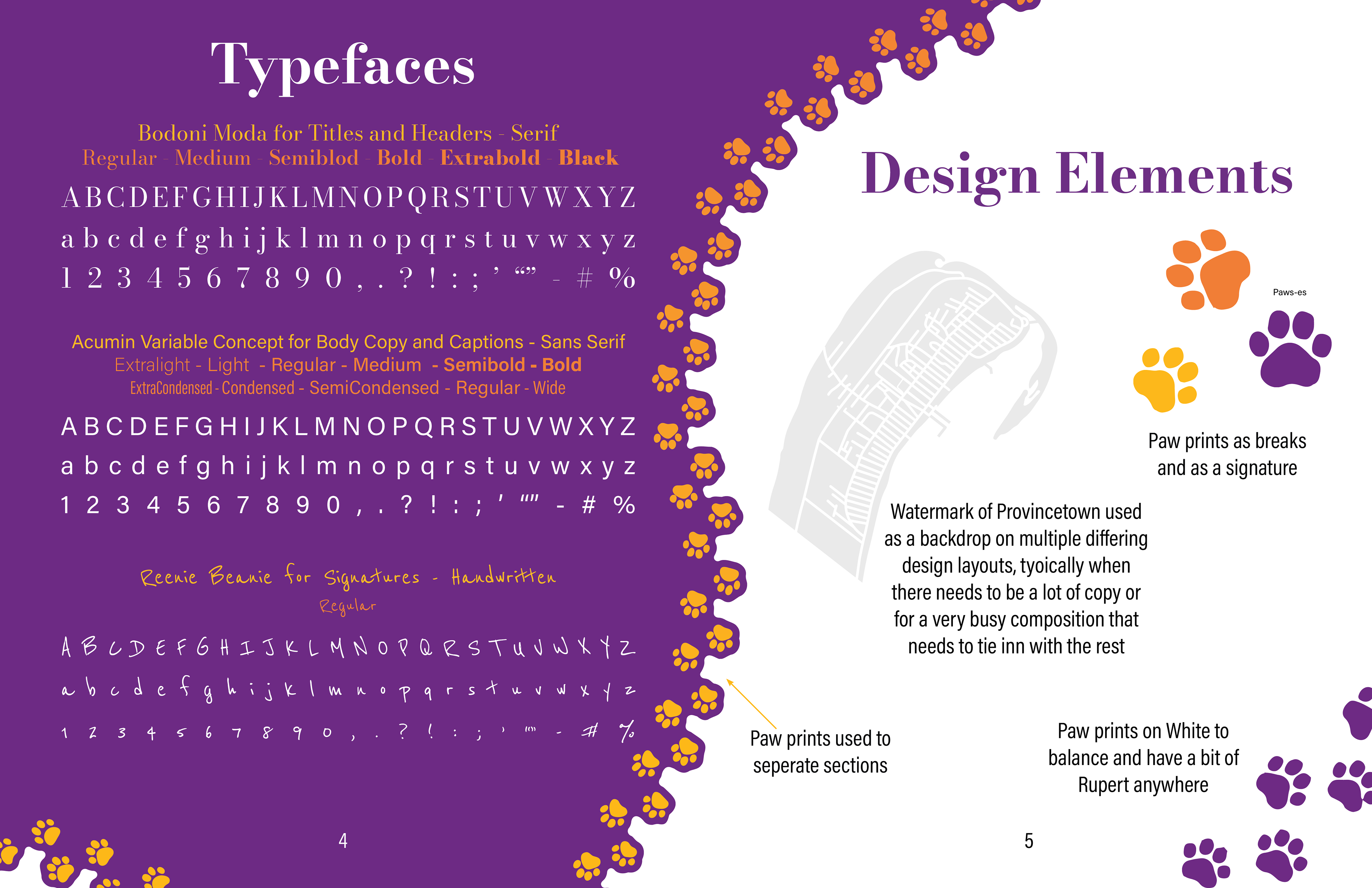
Description of design elements, as well as typefaces and purposes.
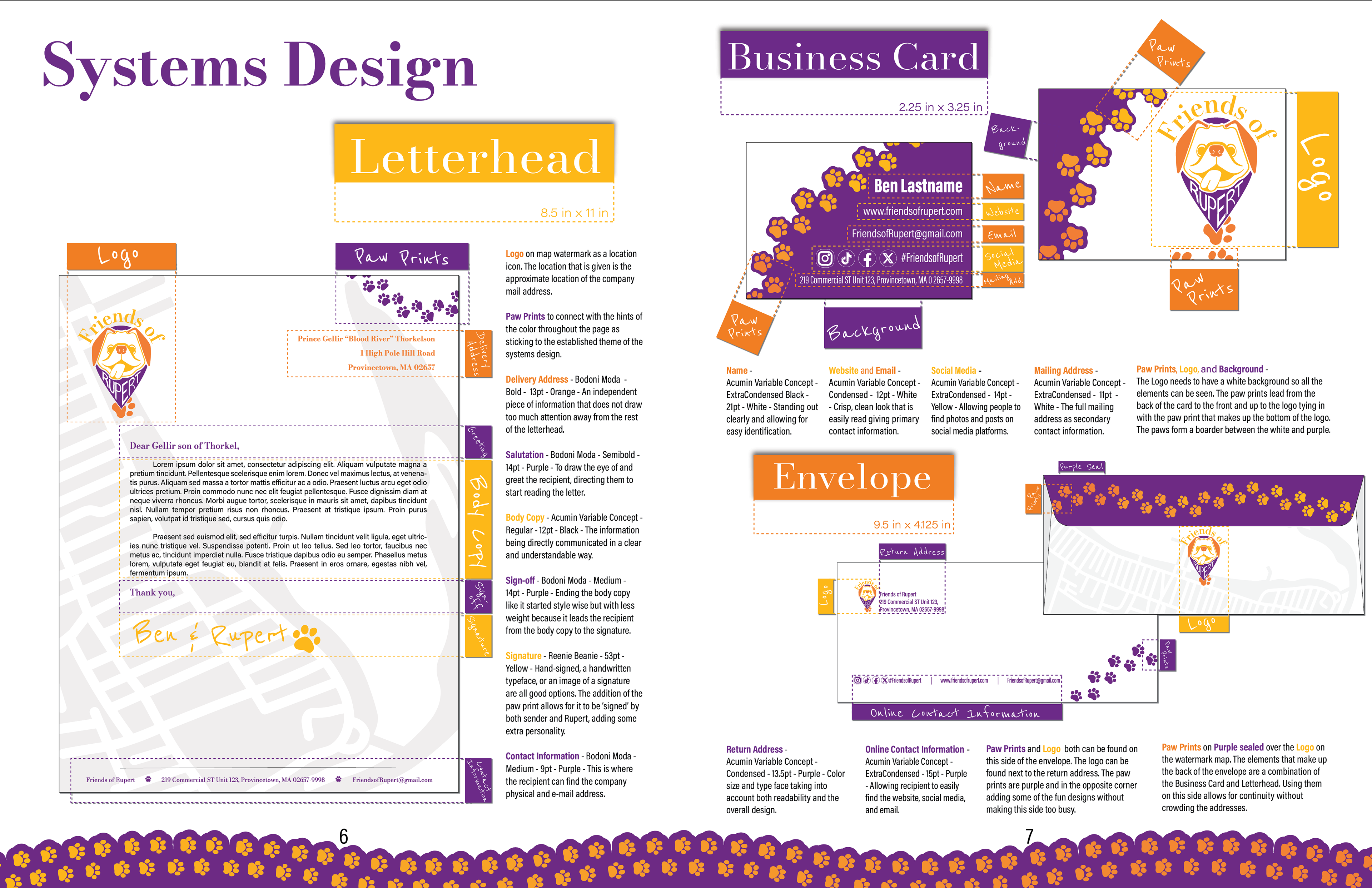
A breakdown of the system design using sticky note like tabs to identify elements and explain them.
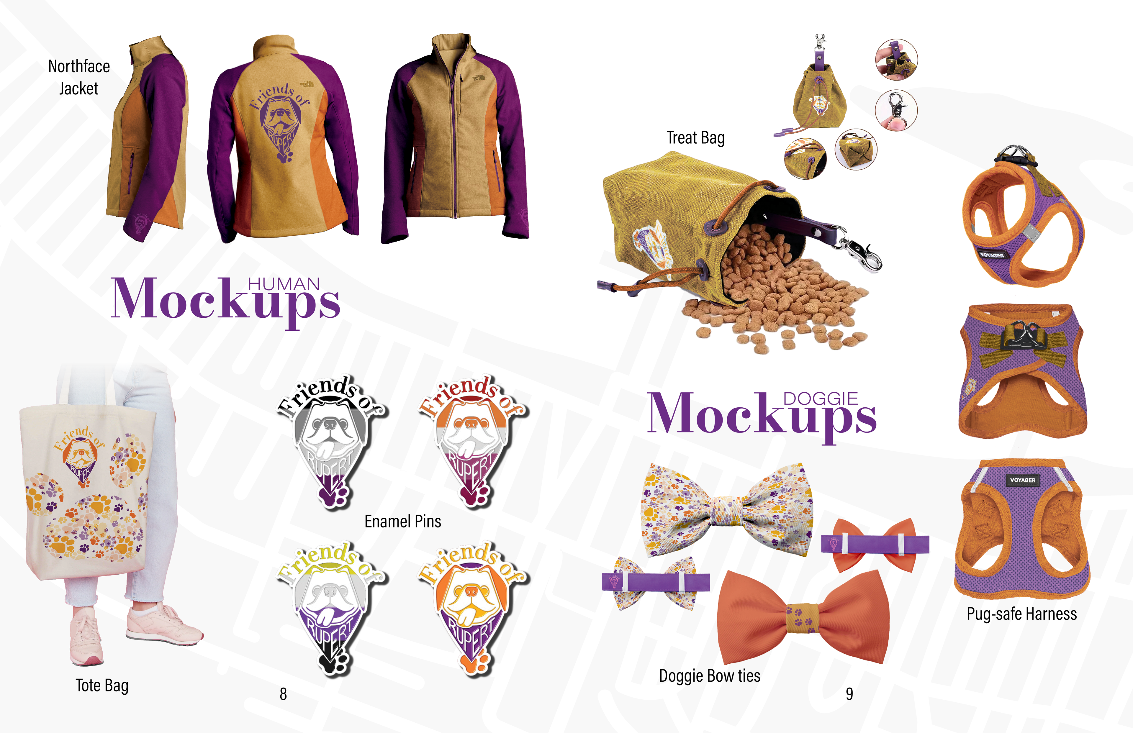
Mock up, separated by human and doggie. They each have a storage container, a outerwear item, and an ornamental object. All of these were created in Photoshop.
Back cover