
Foreign Policy

The Economy

Immigration
Overview: Political poster series, size 24 x 36, utilizing typographical layout, specific representational motif, and a color palette to stay connected. Focusing on the political platform of Donald Trump for the 2024 election, creating satire, political posters, and referencing his promises on foreign policy, the economy, and immigration. Dehumanizing him through taking away his face, but making a caricature out of him through the representation of his hair, skin, and weight. The typography is laid out so that the words "don’t let him…” are at the top-left. Followed by a word meant to be reassuring in quotations, and the rest of the statement. The last two or three words are emphasized by using a thicker typeface and a different color. All three have the words vote Harris as Kamala Harris is the Canada these posters are supporting.
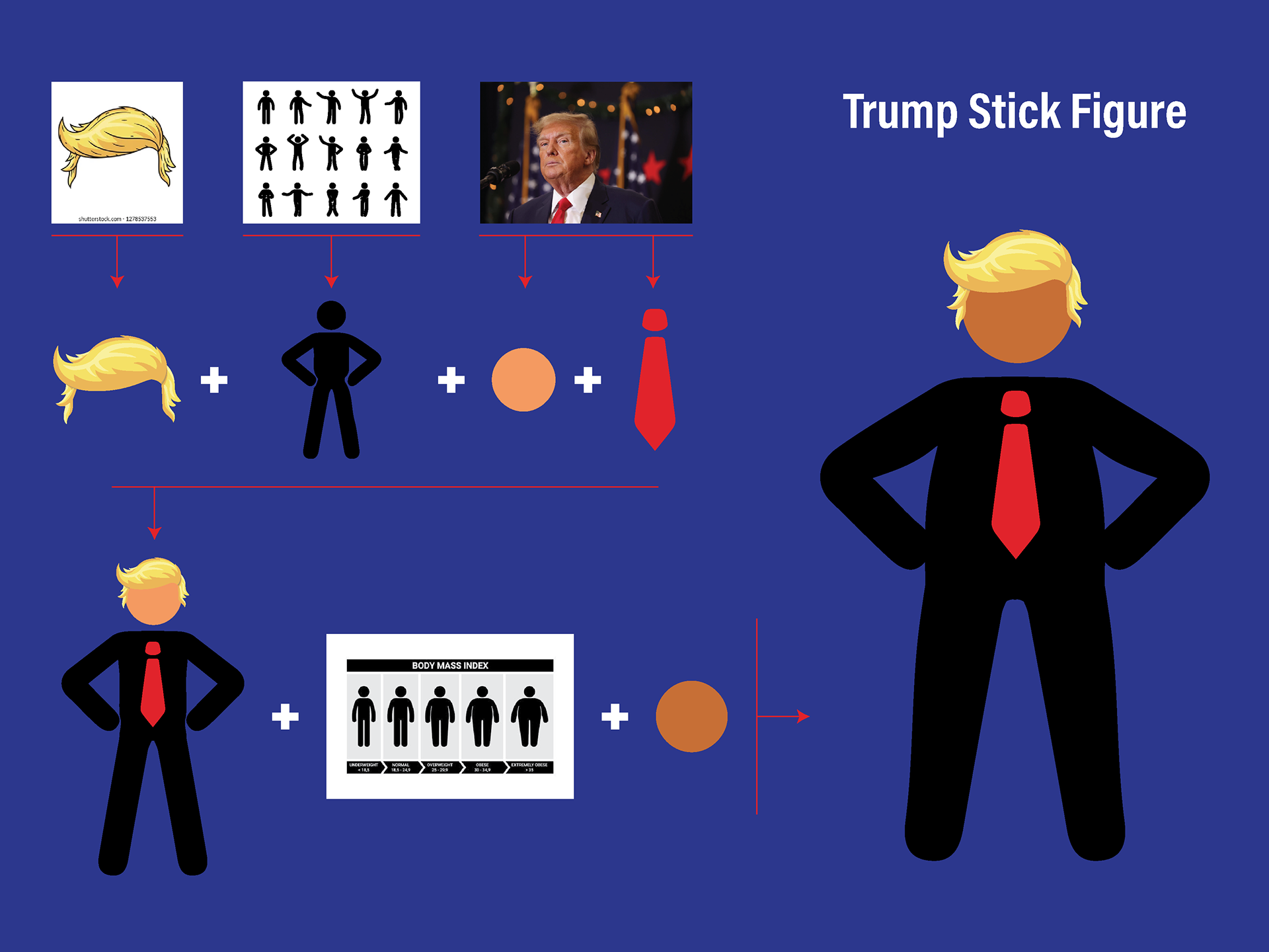
Stick Figure: Instead of illustrating him or editing a photo, I decided to illustrate his hair on a stick figure. I decided to go with a stick figure because of its simplicity. There were so many images and illustrations of him at the time that I wanted to create a simpler version so the message didn’t get lost in the details. Using stick figures, I was able to create a caricature of him without any facial features by adding only the essential details to create the illusion. I started by researching stick figures and hair illustrations and using a source image. After the first iterations were done, there was still something off. I first added more height without going so far that his weight is all that is focused on. When that didn't fully resolve the figure, I also changed the skin tone to make it more contrasted with the hair.
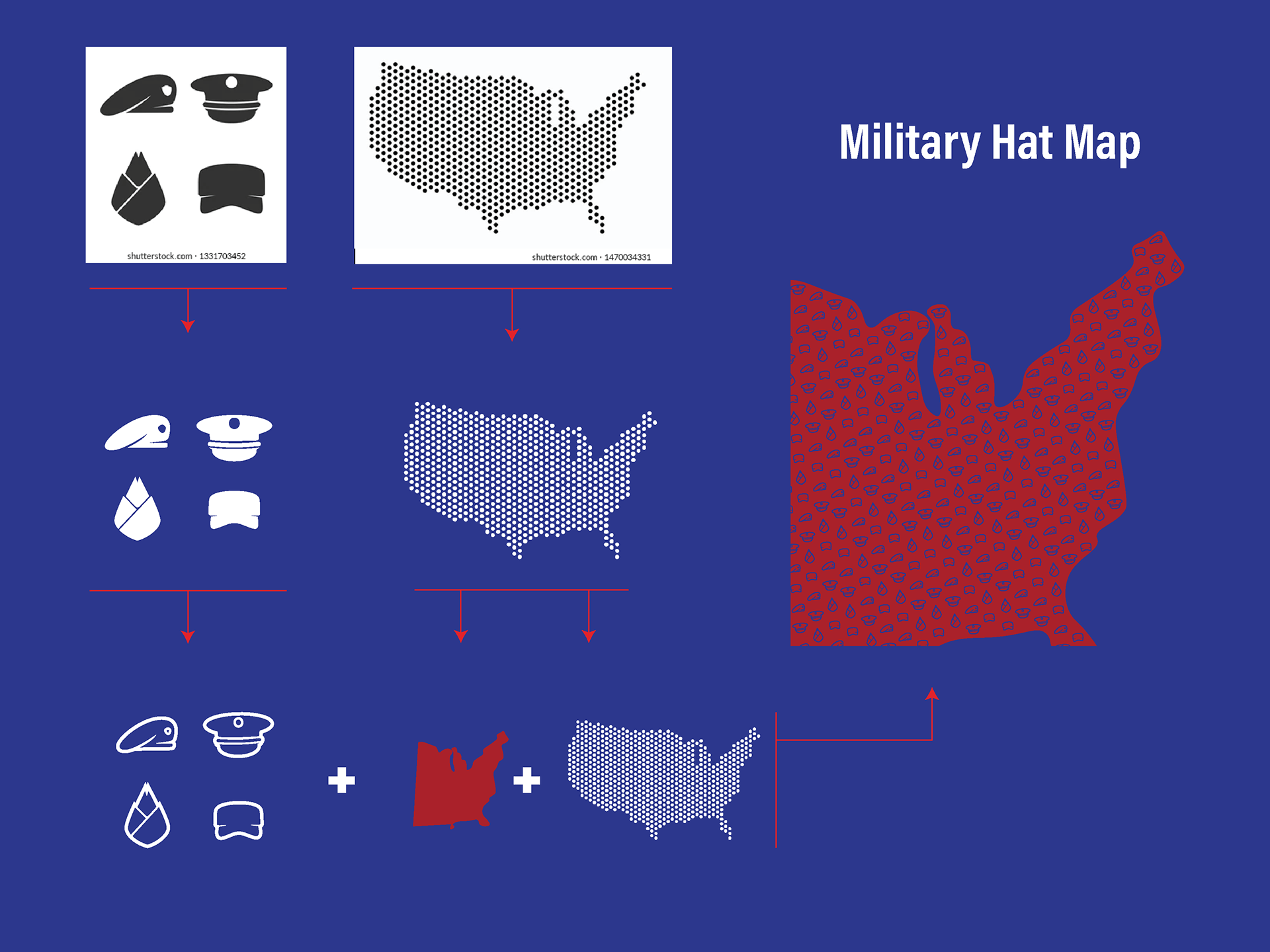
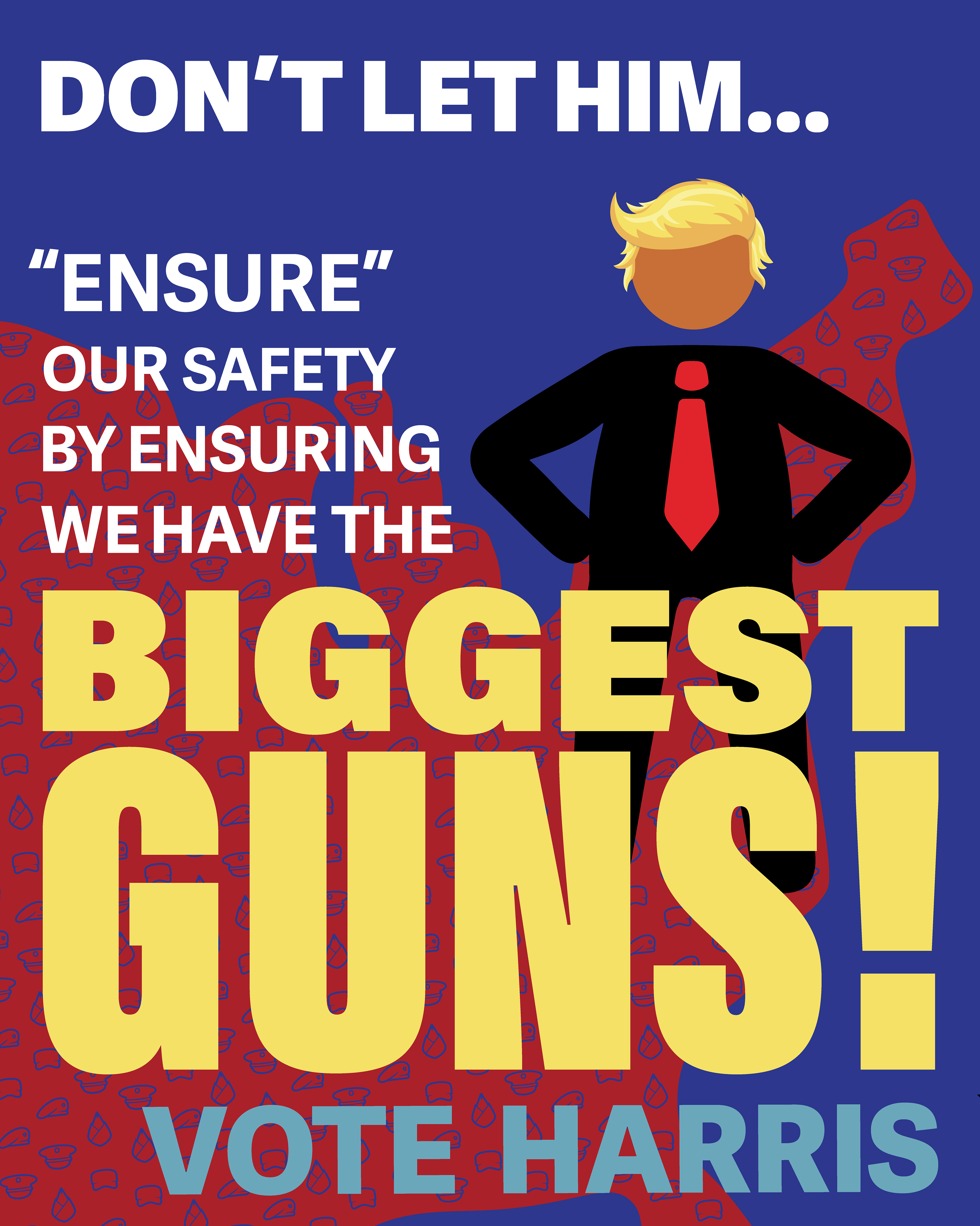
Foreign Policy: The foreign policy promises that stood out to me were to prevent World War III, build a great Iron Dome missile defense shield, and make our military the most powerful in the world. I choose to focus on the strength and military to be the most powerful in the world. I decided to represent this by icons of military hats, forming the shape of the US. I found and traced military hat icons, keeping it simple and limiting it to four that were easily distinguishable from one another. I also found a version of the United States that was made up of dots to help me with placement and create an outline.
When it came to the layout, I decided to place the stick figure of Trump on the US map. I made sure to place his foot in approximately the same place as DC. I chose the phrase "biggest guns!" to emphasize because I wanted to invoke the Cold War and the arms race. This was the most text-heavy of the types on these posters, and balancing it was difficult.
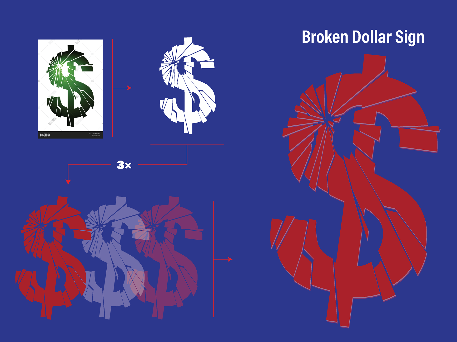
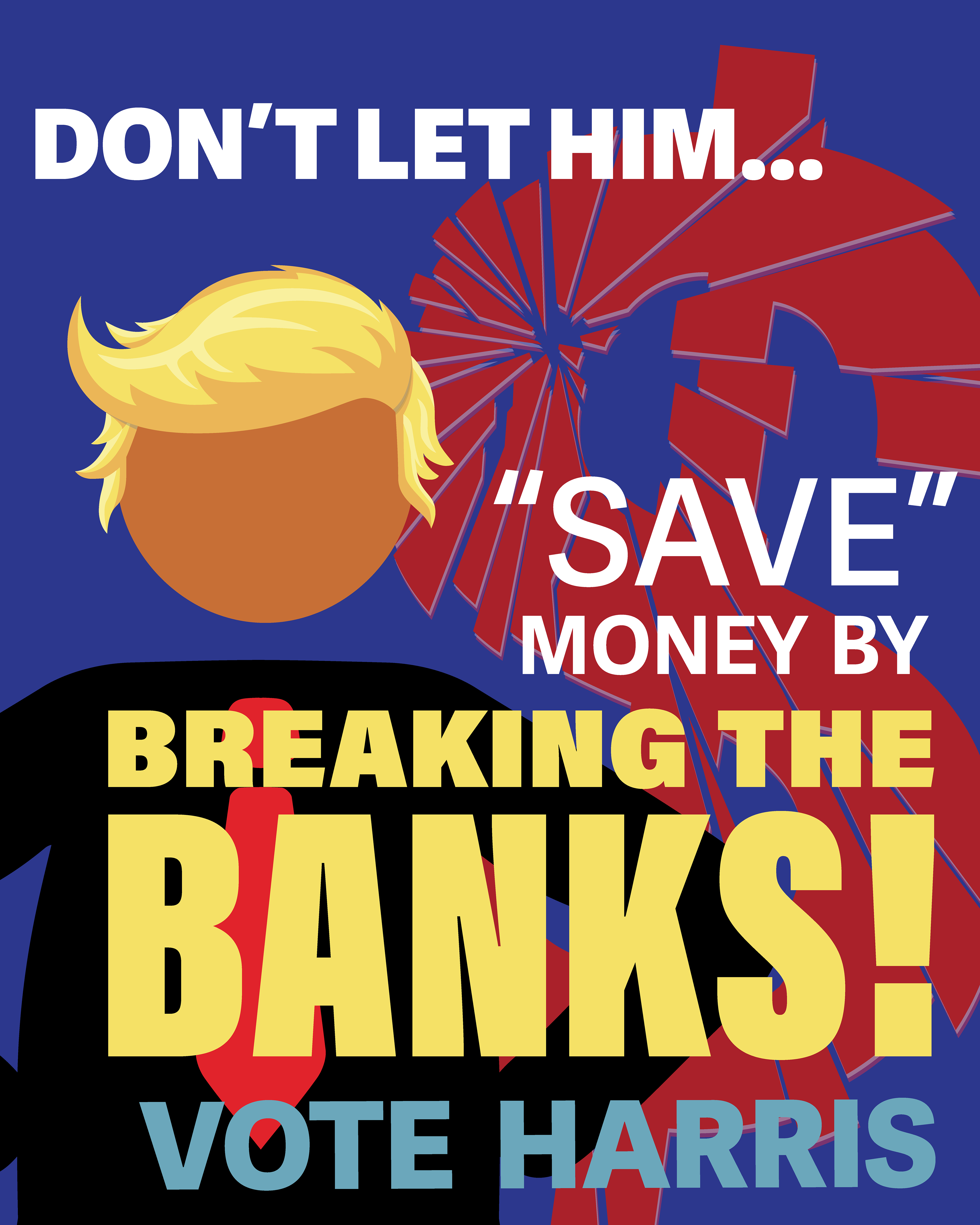
The Economy: Like any campaign, Trump made many promises about the economy, given how large an issue it is. There are many things, including tax cuts, putting in place tariffs, making the US a manufacturing superpower, and cutting funding to schools that push "inappropriate racial, sexual, or political content" on children. One of the biggest promises was to end inflation and "make America affordable again". This was probably the simplest idea for the background; however, because of its simplicity, I was worried it would be too flat, so adding a slight highlight and a slate shadow with the lower-opacity white and red sign underneath helped highlight the broken pieces and give it more emphasis.
When it came to figuring out the layout, I started by positioning the dollar sign and the Trump Figure. Making sure the largest word is "'save'" with "breaking the banks!" This allows someone who is just walking by to notice the figure and know who it's about, notice the words breaking the banks through the correlation between the hair color and the size of the words, then notice the background and the word "save" in quotation marks. Allowing the message to get across in as few elements as possible.
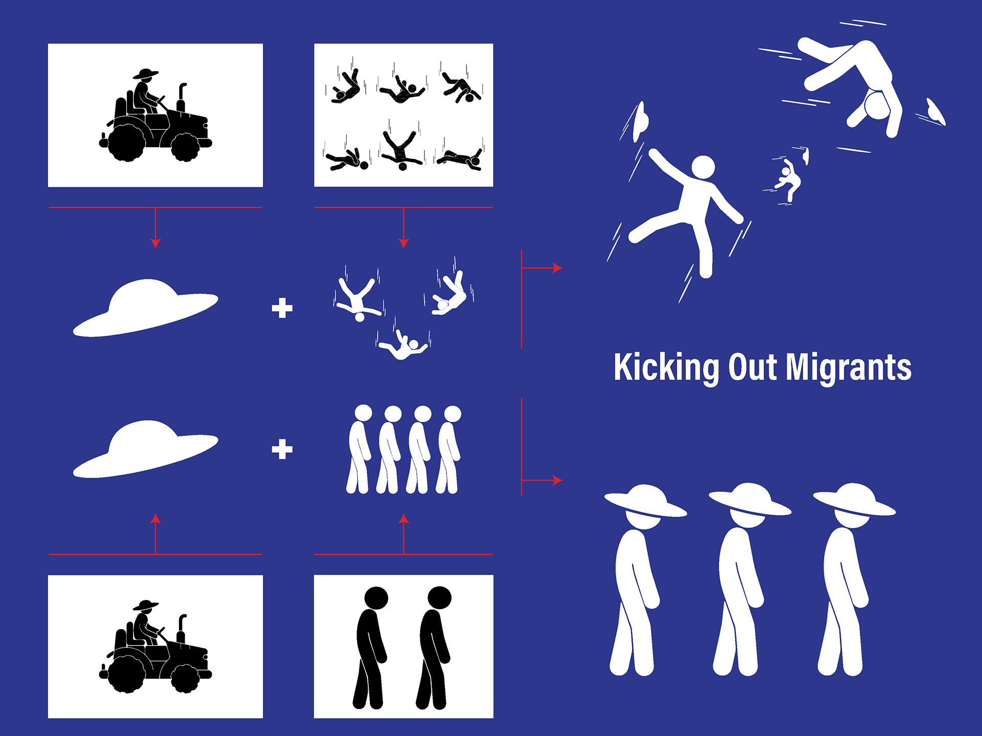
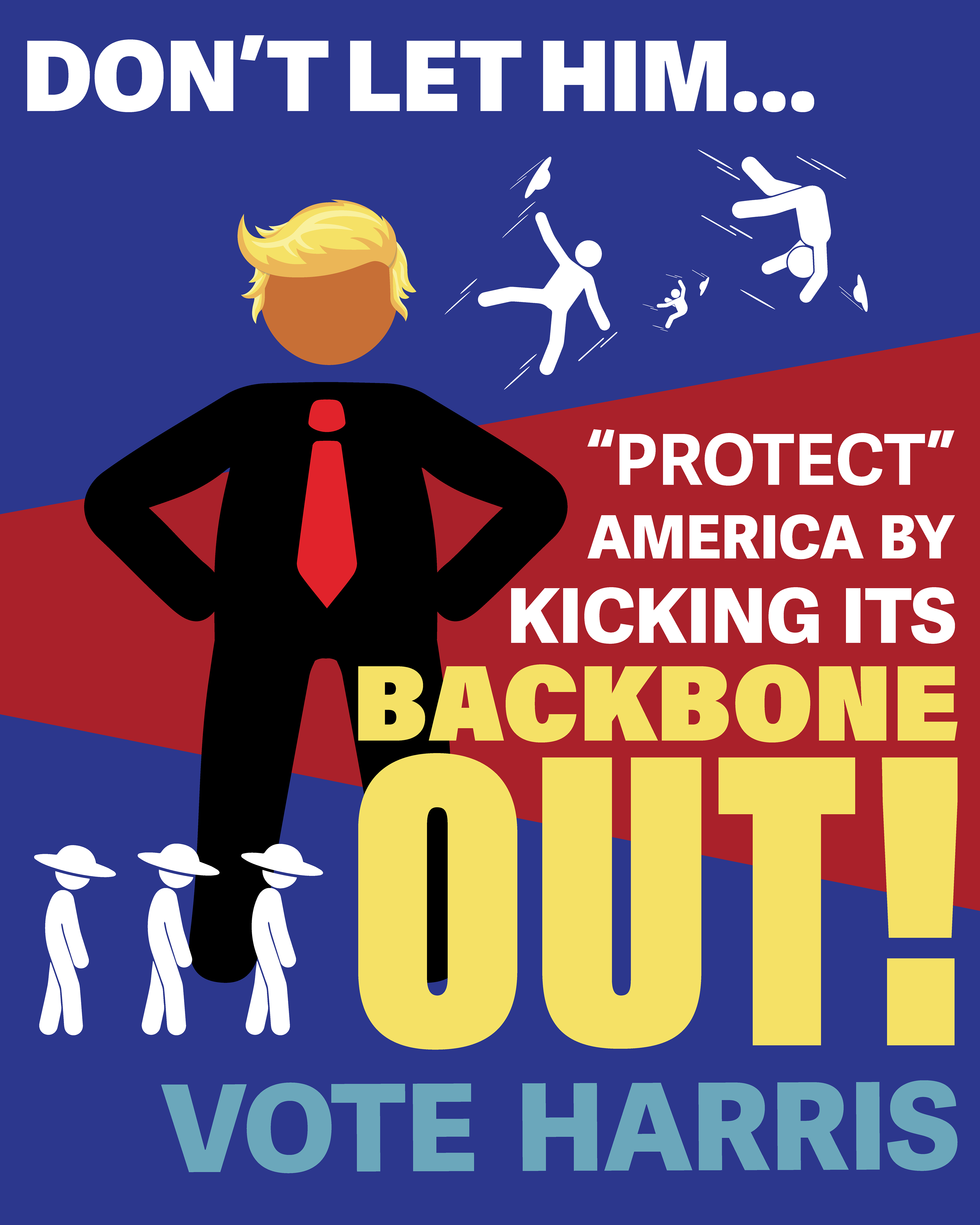
Immigration: When it came to this one, it was difficult to figure out how I wanted to represent it. However, since "the wall" and "sealing the border" were such big things during his campaigns, I decided to use them. I chose to represent migrants as stick figures, whose only identifying feature is the hat, to convey that they are not seen as individual people. The reason for the hats is that they refer to migrant workers who support many industries, including farming, in the United States.
When designing the layout, this is the first of the posters that conveys perspective, with the red wall starting on the left, smaller and then getting larger the further right it moves, and the staggered sizes of the falling/thrown figures. The figures representing the migrants are given the strongest contrast out of all the imagery because I wanted them to be visible and as different as possible from the Trump Figure. When finding a position in there were three things I wanted to have specific placement. These were the figures heading towards the wall, the baseline of the highlighted words and Trump's feet. I wanted the baseline and the figures to have a stronger connection which is why they have the alignment of the baseline in the bottom of the feet, and then slightly further up is Trump's feet that they are heading towards almost like he is literally kicking them out.